So, this might be the strangest financial quarter of all time. At one point, a third of the planet’s population was in pandemic lock-down plunging economic activity into a deep freeze. And yet, global stock markets are about to post a stunning recovery from pandemic despair with a whopping three month return of 18% for investors. I’m half expecting Monty Python’s limbless Black Knight to appear on CNBC and tell Jim Cramer, “Tis but a scratch…”. Please excuse the effort at dark comedy; rather treat it as a weak effort on my behalf to hide confusion.
Yep, no point hiding it. It’s all very confusing for me. Rather than blather on about accepted capital markets norms in long paragraphs of text I thought some financial charts might be a better way of explaining my confusion. Don’t get me wrong, I am not saying stock markets and investors are Black Knights of laughable optimism. Quite the contrary, equity markets and investors discount the future (not present challenges) and I have absolutely no evidence to suggest that economic activity will not return to its pre-Covid scenario of Goldilocks growth and low inflation. No, my confusion is that nearly all financial instruments/assets are rising in value. Arguably, these other assets are discounting a less brilliant future.
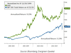
Traditionally, gold and bonds have been considered “safe havens” to protect wealth in times of turmoil. These two asset classes have not just been flying in recent months, but actually for more than 20 years. Bloomberg and Gavekal illustrate in the chart below that gold has been quietly killing equities on performance over the past two decades.
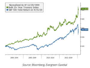
The stellar performance of bond markets thanks to low interest rates is probably more widely known but it might surprise to see the tech-powered S&P 500 struggle to keep up, even in recent FAANG-tastic years….
Leaving aside twenty year trends, it is rather strange to see bonds, equities and gold all roaring higher during what we can all agree is a period of significant uncertainty. Of course, there is another explanation for investors buying all asset classes – the enormous monetary stimulus coming from central banks and governments. Current estimates of that funding pulse are as high as $10 trillion. If we assume global GDP has a very painful year-on-year contraction of 5% in 2020 that would equate to a $4 trillon loss. That sounds like a $10 trillion injection to plug a $4 trillion hole leaving a balance of $6 trillion likely to rush into the financial system. What’s not to like about that if you are an investor in risk assets?
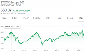
It is early days yet but an interesting possibility that a massive emergency stimulus response to a pandemic could rip up the sclerotic inflation play book of the past twenty years. In that instance, the “sick man” of financial markets, Europe, could finally attract real interest and performance. I leave you with a chart of European equities still almost 10% lower than two decades ago, and a potential and much needed Covid19 recovery….