
Whisper it quietly but Santa might deliver a nice surprise for equity investors by year-end. The source of our optimism stems from activity in a sector upon which we usually hesitate to lavish affection; the banks. The headline news that US equity markets are touching all-time highs is hardly revelatory fare for even the most casual reader of the business press. Indeed, we are often wary of Mr Market’s delight in generating such gushing headlines to attract the maximum number of enthusiastic investors back into stocks before delivering crushing pain.
Our cautious optimism this time is the return of the US banking sector to 12-month performance highs as captured in the following chart:
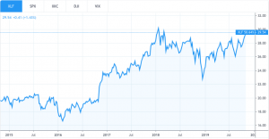
What is worth watching over the next few trading days is whether the chart pattern can “break out” and move above previous highs set at the beginning of 2018. It is true that the US earnings season for corporates has been reasonably positive but the market is still very dependent on the technology sector. To put that concern in context we were struck by a stunning recent data point; the combined $2.3 trillion (yes) market value of Apple and Microsoft now exceeds the total value of all publicly traded companies in… Germany. The Teutonic manufacturing monster is just the 3rd largest exporting nation in the world and 4th ranked economy globally.
The other way of expressing this hope in financial market terms is that the “value” style of investing is due a comeback after years of underperforming “growth” stocks fueled by the technology sector. Typically periods of value outperformance are rather short and very significant so we should find out rather soon if the market driver baton is passed on to the laggard value sectors like energy, mining, banks, etc. Of course, the financial press will quickly create a macro/geopolitical narrative to “explain” the melt-up in equities markets. Take your pick from the following two early favourites:
- Potential de-escalation of US-China trade tensions.
- China turning on the credit spigot again and the Yuan stabilizing.
Of course, these potential macro developments are helpful but let’s be very frank here. There is really only one financial datapoint that counts; how much money(at zero cost) or liquidity is being pumped into markets by the central banks, led by the Fed.
As a quick reminder, in 2018 central banks tried to remove financial markets from the monetary methadone clinic by phasing out quantitative easing(QE) and actually raising rates. The result was a very large negative bag of performance coal from Santa at the end of 2018.
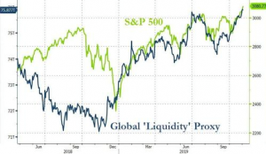
Now check out the policy u-turn by central banks in 2019 with the Fed cutting interest rates for the third time in recent days. By some measures global liquidity provided by central banks has passed the $75 trillion mark and it doesn’t look likely to stop for some time. See in the following chart how the S&P 500 is moving in lock-step with central bank largesse in 2019. Note this in sharp contrast to the pattern in 2018 when liquidity was drained and interest rates were hiked by monetary authorities across the globe.
Enjoyed this blog? Then why not check out our other great content by clicking here!